dieUX Accessibility Statement
1. Introduction
1.1. Pat's dieUX cartoon pages are designed to fulfil the purposes of accessibility research. The usability testing sites Version A and Version B mimic popular coding strategies that challenge accessibility.
Pat Godfrey“Accessibility is our human right: an inclusive experience should be too.”
VoiceOver for iOS
1.2. People using VoiceOver for iOS can set their screen reader to read the entire page with a two-fingered swipe up. Get help with iOS VoiceOver gestures.
2. Images
2.1. The dieUX cartoon strips are presented accessibly on the homepage. They represent a successful challenge to web coding and accessibility strategies. Those on the usability testing pages Version A and Version B are designed to frustrate and both are WCAG compliant.
2.2. The strips are chosen for this study as they:
- Contain image texts, which are longer than the 120 characters recommended for alternative texts.
- Are responsive and being wide landscape, the images shrink too small to read the texts from in narrower viewports.
- Have contexts and 'text', the accuracy of which is essential to their understanding and the enjoyment of their humour or irony, etc.
2.3. Where thought correct, images are:
- Given a short alternative text informing of the series, the format, and outline topic area.
- Given
widthandheightattributes. - Made responsive using the
<picture>element and CSS styling. - Presented with the
figuretag. - Accompanied by a
figcaptionelement with the cartoon strip heading and descriptive version of the strip.
2.4. Where thought correct, images are optimised for ease of loading and given meaningful file names.
2.6. For the study, the three test pages A, B, and C each comply with WCAG. Their inclusive design varies from very poor to very good. Study participants reported the difference in their experience between their visits to each of the pages.
3. Design patterns
3.1. For the purposes of this study, some design patterns will prove difficult to access. These intentionally demonstrate industry common practice or demonstrate part of an evolving design. They may, or may not conform to accessibility guidelines or legislation.
3.2. Where thought correct, some patterns are engineered to be highly accessible and may fail under testing.
4. Scripting
4.1. Where thought correct, the accessible content is created to the following mantra:
- HTML for content.
- CSS for presentation.
- JavaScript for functions.
4.2. This mantra ensures:
- JavaScript updates CSS classes and not presentational attributes within the HTML.
- CSS is responsible for all presentation. Certain HTML tags are employed to give emphasis to text including:
<strong><em><mark>
4.3. Some content is deliberately made available only to screen-readers and to Braille displays, and always available to the DOM. This is not to discriminate visual users and only supports cognition for our visually impaired and other users employing assistive browsing technologies.
5. Web Content Accessibility Guidelines (WCAG)
5.1. This website conforms to WCAG 2.1.—even the deliberately inaccessible bits! It's kind of the point.
5.2. An exception was the duplicity of the homepage link and site logo link to the homepage. This is now corrected
Contrast
5.3. Web Aim's Contrast Checker is used to verify the choice of colour schemes. The following are examples of compliant styles on September 1, 2023:
| Element | Foreground (copy) | Background | WCAG contrast result |
|---|---|---|---|
| Page navigation headline | Black (#000000) | Grey (#DADADA) | AAA for normal text |
| Inline link text | Blue (#00FFFF) | White (#FFFFFF) | AAA Pass for normal text |
| Page navigation focus | Yellow (#FFFF00) | Black (#000000) | AAA Pass for normal text |
Inline <Code> |
Aqua (#00FFFF) | Dark charcoal (#333333) | AAA Pass for normal text |
| Page date and star images | Golden brown (#996515) | White (#FFFFFF) | AA Pass for normal text AAA Pass for large text |
| Figure component diagram image copy | Golden brown (#D4145A) | White (#FFFFFF) | AA Pass for normal text AAA Pass for large text |
6. Accessible Rich Internet Applications (ARIA)
6.1. ARIA is employed on the caption toggle button and figcaption expand and collapse interaction.
6.2. The toggle button is marked, aria-hidden="true" to negate its appearance in the accessibility tree.
6.3. The rationale under test is that the figcaption is not hidden from the DOM or accessibility tree, and only visibly hidden. This negates screen-reader users requiring the toggle button, so why bother them with it? It's what is being tested, so your feedback is welcome.
6.4. The outline strategy meets ARIA guidance.
7. User testing
7.1. User tests were carried out by candidates representing a selection of ability scenarios.
7.2. Sighted users were invited to complete tasks that require access to the content of the cartton strips and other infographics. Certain coding is tailored to frustrate the task and to simulate the experience of screen reader users.
7.3. In his 2019 research, Pat found that 50 of 50 cartoon websites featured content that was inaccessible to screen-readers or to Braille displays. Given the importance of cartoons to political and social commentry and persuasion, it is only criminal to occlude Assitive Technology users from accessing this most important content.
8. Errors
8.1. Errors are a feature of prototypes. They are what we learn from.
8.2. The following compliance tests were completed on the site:
- HTML Validation. Residual 'Warnings' for using
role="navigation"on<nav>elements as recommended in some articles discussing screen-reader testing. - WAVE Accessibility Test. There was an issue with redundant links when including a logo as a Homepage link and adding another Homepage link for people not familiar with the logo being the Home link. WAVE likes a target for
<href="#top">, too, which we know is built in to HTML browsers? - CSS Validation. The definition list deliberately shares a color value between the
<dt>background and border to key in with the<dd>style. There is no detriment to the accessibility.
Error Corrections
This cartoon strip is awarded 3-stars of 5.
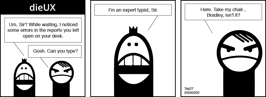
The intern is left waiting by our senior designer's desk. "Um, Sir?" He starts, "While waiting, I noticed some errors in the reports you left open on your desk." Our designer thinks quickly and says, "Gosh. Can you type?"
The intern brags, "I am an expert typist, Sir". Our designer moves aside and tells the intern, "Here. Take my chair. Bradley, isn't it?"
9. Your feedback
9.1. When you feel you can improve my accesibility practice then please do reach out to me at pat.godfrey@learningtoo.eu.