Instructions
Adjust the width of your browser. Smartphone users may detect a difference when rotating their device.
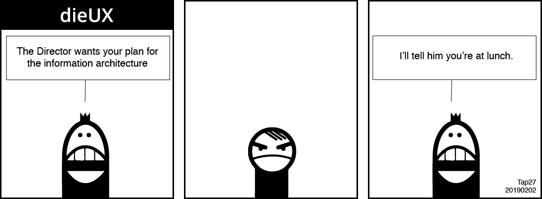
[Assistant] The Director wants your plan for the information architecture.
[Our Designer] Says nothing.
[Assistant] I'll tell him you are at lunch.
Adjust the width of your browser. Smartphone users may detect a difference when rotating their device.
Design 09: Following work equalising the experience of the button and figcaption the visual experience of the image needs attention when presented within different widths of viewport. Currently, the image overflows the document when the viewport is narrowed to less than the image width.
We use CSS to make the image shrink and grow predictably according to the size of its container.
In this demonstration, the image is set to 100% of the width of each of two containers set to 60% and 30% widths. It solves some problems and creates a new one: the image can shrink too small to read the image text. Although the caption offers alternative content, it may not meet all users' preferences equally. More work needs done.
img {
	width:n%;/*Where n = 0 - 100*/
	height:auto;
	}