Instructions
Adjust the width of your browser. Smartphone users may detect a difference when rotating their device.
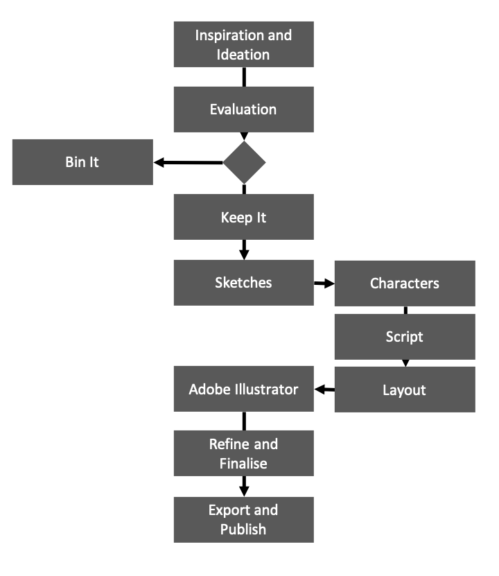
The following image displays with its default HTML settings. It can overflow its container in narrower viewports.
Adjust the width of your browser. Smartphone users may detect a difference when rotating their device.
The image is made fluid responsive using CSS to prevent its overflowing off the viewport.
Now, in narrow viewports and on mobile phone devices, the image text content is only just discernable. As the image content cannot be discerned by all users, an alternative content strategy is needed and the alt attribute is not a visible strategy.
<h2>My Design Workflow</h2>
<img src="../img/dieUX-workflow-legacy.png" width="720" height="831" alt="workflow">
section {
	margin:2em auto;
	padding: 1rem;
	width:80%;
	min-width:0px;
	border-left:3px dashed grey;
	border-right:3px dashed grey;
}
section img {
	width:100%;
	height:auto;
}
img[alt] {
	color:#777;
	font-size:1.5em;
	font-style:oblique;
}