About this dieUX project
These pages formed part of my MSc UX Design 2018-2020 dissertation taken with IADT Dun Laoghaire. Introducing my dieUX cartoon strips removed ethical complexities and issues around image use and copyright. The dieUX cartoon website is inevitable. This isn't it, yet.
My research explored the following hypothesis:
"There is a gap between accessibility (research, guidelines, and education) and the inclusive design required for image contents to meet the needs of all users .
Explanatory video
The following 3-minute video explains the project and this prototype's development of an inclusive image content strategy.
Focus and outcomes
My focus was the experience of images containing complex visual and text content. Cartoons fit that description.
I found 50 of 50 websites featuring cartoon content were inaccessible to screen readers. Infographics were also presented badly. Cartoons are an entertaining topic and are used for political and social influence. Infographics share similar attributes. A prototype website with cartoons was inevitable.
Allied outcomes you can read about in my blog include:
- Shaking the Alt Decision Tree to simplify the WCAG alt decision tree for mortals to use.
- An Inclusive Nested List Nomenclature to improve screen-reader announcement of nested ordered lists.
- Creating "Golden Bullets" that prevent unnecessary screen reader announcements when writing unordered lists.
- A website accessibility scoring system. It wasn't all reliable and remained more useful than automated test results alone.
Website design
"If you don’t want to make accessible apps, then you are a terrible person and you shouldn’t be making apps for anybody. You should be doing something else."
Dinculescu (2016).
The design goal was for an inclusive and usable prototype. The contrast and choice of typography support reading across a range of accessibility scenarios. CSS can update the art direction at any time. That's how inclusive design works from the content, to function, and then toward decoration.
A tough gig
"When we work on making our devices accessible by the blind, I don’t consider the bloody ROI. When I think about doing the right thing, I don’t think about an ROI. If that’s a hard line for you, then you should get out of the stock."
Tim Cook (Appple) in Los Angeles Times (2014).
The tutors viewed the prototype poorly. It's content-first focus and lack of colourful art direction falls short of how a decent UX project should look. I can shrug that off. The design is based on the accessible RNIB website of the day. Similarly, this prototype is designed for consumption across as many ability scenarios as possible, caveat my not being an accessibility engineer.
I believe the institution's opinion was typical of our industry's educators and leaders of that time. It's this visual ableism and graphic-first approach that the project sought to overcome. I'm really not surprised they proved my hyothesis. Thankfully, there's a whif of change in the air and about time too. We've been banging this drum since before 2012.
Accessible in Pink
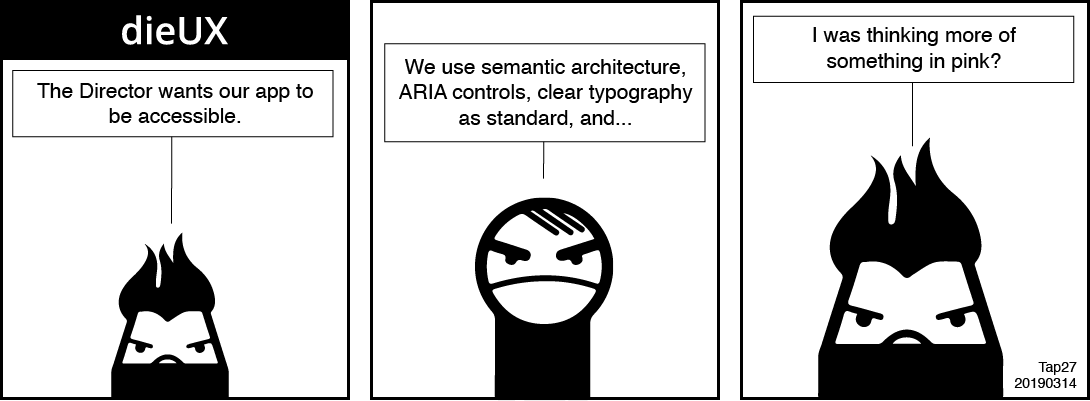
This cartoon strip is awarded 4-stars of 5.

Our senior designer's trendy young colleague relays the UX Director's brief that the new app must be accessible.
Our senior designer reminds her that, "We use semantic architecture, ARIA controls, clear typography as standard and…". His colleague cuts him off short. "I was thinking more of something in pink?" She replies indignantly.
Usability testing
I tested three versions A, B, and C of the same webpage. Each had an identical list of tasks and I measured the differences in satisfaction between them. Each webpage is fully responsive and "mobile friendly" although the tests were designed to be completed on desktop. This was to ease the effort needed to navigate between the survey and test browser tabs on smartphones. It worked really well in the lab environment.
The test was designed for face-to-face interventions. In the lab, moderation steered participants away from distractions they learned when testing other students' projects. I needed to encourage them to move on when they couldn't complete a task.
User Testing
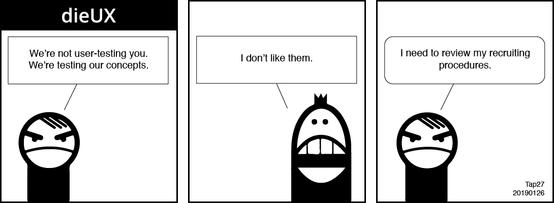
This cartoon strip is awarded 4-stars of 5.

It's user testing day. Our senior designer introduces the tests to the recruit. "We're not testing you. We're testing our concepts." The recruit responds quickly with, "I don't like them."
Our senior designer reflects aside, "I need to review my recruiting procedures."
External candidates were scheduled just as the COVID-19 virus hit and our governments locked us all away in our homes. My planned guerrilla and moderated testing was abandoned. Luckily, I had published the prototype online for unmoderated use by candidates recruited from private Facebook groups. I hoped to attract people who are blind.
On deployment, the difficulties experienced by unmoderated visual candidates when swapping tabs in smartphone browsers proved a distraction. The results were skewed by difficulties experienced when changing between the survey instructions and each test page. Interestingly, candidates using a screen reader didn't report the same problem. You can read some of their comments in the Feedback section.
Test website versions A, B, and C
The usability testing websites are available as follows:
- Version A. The images fail to load and the
altvalue is useless. - Version B. As for Version A, and the Toggle Caption feature is offered.
- Version C. As for Version B, and the images load.
Participants were asked to visit each of the three websites in turn. For each one, they were to report on their experience of each of the three search tasks. Measures included qualitative and quantitative reporting of task performance and the candidates' impressions of accessibility and experience.
"If you don't have the occasional failure, you are not experimenting enough. One must go too far to discover how far one can go."
Petty (1998, p.422).
Findings
There was a 300% improvement in satisfaction with the experience between Versions A and C for people consuming the content visually. That's encouraging when the tests replicate the experience of images that fail to load and for people who are blind. Student candidates also learned the importance of an inclusive content experience.
Our largely visually ableist industry can take note. Our traditional designer training and awards prioritise and value the visual experience. From designing a flow to deployment, we need a more inclusive approach.
The planning of content for visual and auditory consumption needs basic HTML skills. Ability scenarios need testing from the initial content design. We can't keep reaching compliance with accessibility guidelines by converting a visual-first approach at the close of the product cycle. Nor can we release a minimal viable product (MVP) that fails to meet compliance.
Breaking guidelines
Our design medium is HTML, which is largely accessible out of the box. We add barriers to it when implementing ableist visual designs. WCAG and ARIA may give access to the content and do they enable a comparable or equivalent experience of it? Not always—not for cartoons and infographics. There's always a compromise and it is the people tripping over our barriers that must work hardest to overcome it.
In the dieUX case, several Accessible Rich Internet Applications (ARIA) and WCAG 'rules' were broken or modified to achieve a comparable experience of the cartoon strip content. (ARIA Rule Number 4 and WCAG Success Criteria 4.1.2. in particular). Here, the caption button is available to visual users and ARIA-hidden from screen readers to provide a comparable UX. It works and exploits a caveat available in Section 6.6. of the ARIA guidelines:
"Authors MAY, with caution, use aria-hidden to hide visibly rendered content from assistive technologies only if the act of hiding this content is intended to improve the experience for users of assistive technologies by removing redundant or extraneous content. Authors using aria-hidden to hide visible content from screen readers MUST ensure that identical or equivalent meaning and functionality is exposed to assistive technologies".
I now question if our accessibility guidelines only aim to enable access to visual design. If so, then that's wrong, if useful to fix poor design. Visual design should follow an inclusive content design. Guidelines should feed ambition and innovation too. It seems like ARIA and WCAG are always struggling to keep up.
Accessible mechanics
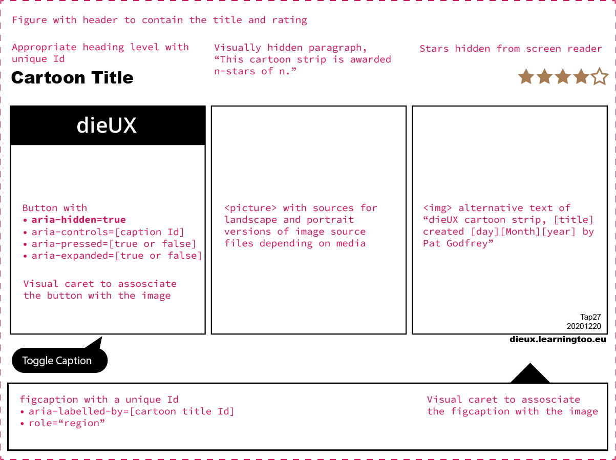
JavaScript adds the component's show and hide function. The HTML and ARIA mechanics are as follows:
- A
figurecontainer. - The cartoon title presented as an appropriate heading level.
- A visually hidden paragraph to announce the cartoon's rating, "This cartoon strip is awarded n-stars of n."
- The star images hidden from screen readers.
- The
picturecontainer with alternative source files to display on wider and narrower viewports. - The fallback
imgwith alternative text of "dieUX cartoon strip, [title] created [day][Month][year] by Pat Godfrey" - The toggle
buttonwith the following ARAI attributes and values, with an accompanying script:- A visual caret to assosciate the button with the image.
- aria-hidden=true
- aria-controls=[caption Id]
- aria-pressed=[true or false]
- aria-expanded=[true or false]
- The
figcaptionwith the following ARIA attributes and values:- A visual caret to assosciate the caption with the image.
- aria-labelled-by=[cartoon title Id]
- role="region"

The only nuance is the toggle button's aria-hidden value of "true". Although appearing to break a hallowed rule of ARIA, it doesn't.
Calvin & Hobbes
Feedback from Facebook groups with members who are blind included a lament that Calvin & Hobbes cartoons are not accessible. They join the cartoons in the 50 websites I tested that are not accessible to people using screen readers. To test this project's outcomes against their complex humour and illustration, dieUX now hosts three Calvin & Hobbes strips. Publishers take note, they work.
What of infographics?
Infographics share characteristics with cartoons and differ in their reference rather than fictional situations (Pedrazzini & Scheuer, 2019). For a flow chart, an image with an empty alt="" inline with one or more ol or ul lists is sensible.
VoiceOver's reading of nested list items was a challenge. Lists created using Markdown as my writing colleagues do sounded awful. Visual readability can be improved with parentheses or whitespace. Whatever the design calls for, there's a solution in CSS and JavaScript!
To overcome the poor audible experience, I experimented with improving the readability of list items. It's possible to programmatically introduce punctuation to each counter— even nested ones. These allow VoiceOver to "take a breath" between the counter and list item content. It sounds so much more friendly and better orients our reader to the levels of nesting.
Inforgaphic thoughts
- Review the Workflow infographic prototype
- Read my blog post, Inclusive nested list nomenclature.
Feedback
Here's some of the great feedback I received from someone who knows accessibility:
"…I looked at your site this morning...and it's quite delightful, really. You've introduced a novel concept for visual content, and I'll admit I was a little skeptical. Moving through the page with a screen reader, though, I was pleased with how clean the presentation of the cartoon strip, caption, and associated information was. All in all, I'd give it a thumbs up! Will it be an ongoing project?"
More feedback…
From my many helpers and target audience on Facebook:
"…Worked fine for me using NVDA on Windows 10...Any chance you could add Calvin And Hobbes strips?"
"…Everything is readable with VoiceOver."
"…Firefox on window 10 pc with NVDA…I was able to hear about the comic interchange a manager and a designer about the website design"
Iterative prototyping
Follow the iterative journey through Pat's HTML prototyping of the core interaction design required to offer accessible image content.
Learn more
Visit my study blog to learn more about this and allied study journeys.
On-page references
- Dinculescu, M. (2016). Practical lessons from a year of building web components [Video File]. Google I/O 2016, Retrieved from https://youtu.be/zfQoleQEa4w.
- Los Angelese Times (March 1, 2014).Apple’s Tim Cook gets feisty, funny and fiery at shareholders meeting.
- Pedrazzini, A. & Scheuer, N. (2019). Modal functioning of rhetorical resources in selected multimodal cartoons [Abstract]. Semiotica. Doi:10.1515/sem-2017-0116.
- Petty, G. (1998). A Practical Guide, Teaching Today (Second Edition). Cheltenham, UK: Stanley Thomas.